knitr::include_graphics(here("figures","linear_regression_2x_xkcd1725.png"))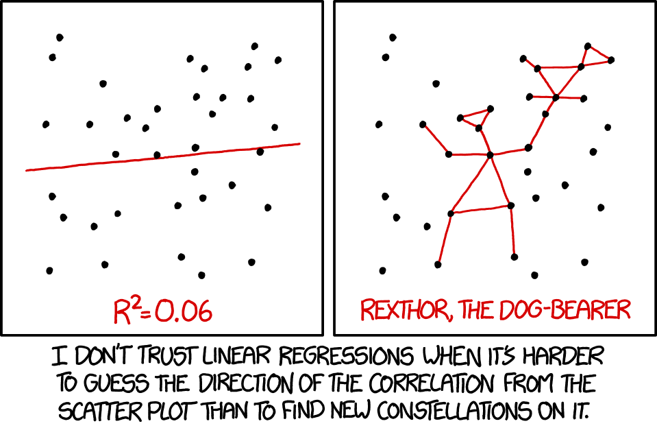
knitr::include_graphics(here("figures","linear_regression_2x_xkcd1725.png"))
For this chapter you will find it useful to have this RStudio project folder if you wish to follow along and try out the exercises at the end.
A class of analytical models that you will use often go under the name General Linear Models. They include linear regression, multiple regression, ANOVA, ANCOVA, Pearson correlation and t-tests.
Despite appearances, these models are all fundamentally linear models. They share a common framework for estimation (least squares) and a common set of criteria that the data must satisfy before they can be used. These criteria centre around the idea of normally distributed residuals. An important stage of any analysis that uses linear models is that these assumptions are checked, as part of the Plot -> Model -> Check Assumptions -> Interpret -> Plot again workflow.
Here, we will go through an example of simple linear regression - suitable for trend data where we wish to predict a continuously varying response, given a value of a single continuous explanatory variable. As we go we show code snippets from a Quarto notebook that does this job, and, at the bottom, an example complete notebook that you could adapt to your own needs.
As a first example, we ask the question: does plant growth rate depend on soil moisture content?
We predict that more moisture will probably allow higher growth rates. We note that this means there will be a clear relationship between the variables, one that should be apparent if we plot the response (dependent) variable - plant growth rate - against the explanatory (independent) variable - soil moisture content. We note that both the explanatory variable and the dependent variables are continuous - they do not have categories.
What we might want to do in linear regression is be able to predict the value of the dependent variable, knowing the value of the independent variable, using a linear model. Just as ofen, we simply want to determine the sensitivity of the dependent variable to changes in the independent variable. In practice, this means drawing a ‘best fit’ straight line through the data and determining the intercept and gradient of this line. It is the gradient that tells us the sensitivity of the dependent variable to chnges in the independent variable, and that is what we most often look out for in the analysis.
library(tidyverse)
library(here)
library(ggfortify)
library(cowplot)We have a data set to explore our question: The plant.growth.rate.csv data set is available as a csv file in the data subfolder of the skeleton project folder you have hopefullly downloaded to go along with this session.
filepath <- here("data","plant.growth.rate.csv")
plants <- read_csv(filepath)
glimpse(plants)
Rows: 50
Columns: 2
$ soil.moisture.content <dbl> 0.470, 0.541, 1.698, 0.826, 0.857, 1.608, 0.250,…
$ plant.growth.rate <dbl> 21.3, 27.0, 39.0, 30.2, 37.1, 43.2, 22.7, 40.2, …We see that the data set contains two continuous variables, as expected.
We can use the package ggplot2, which is part of tidyverse to do this:
plants |>
  ggplot(aes(x=soil.moisture.content, y=plant.growth.rate)) +
  geom_point() +
  labs(x="Soil moisture content",
       y="Plant growth rate (mm/week)") +
  xlim(0,2) +
  ylim(0,50) +
  theme_cowplot()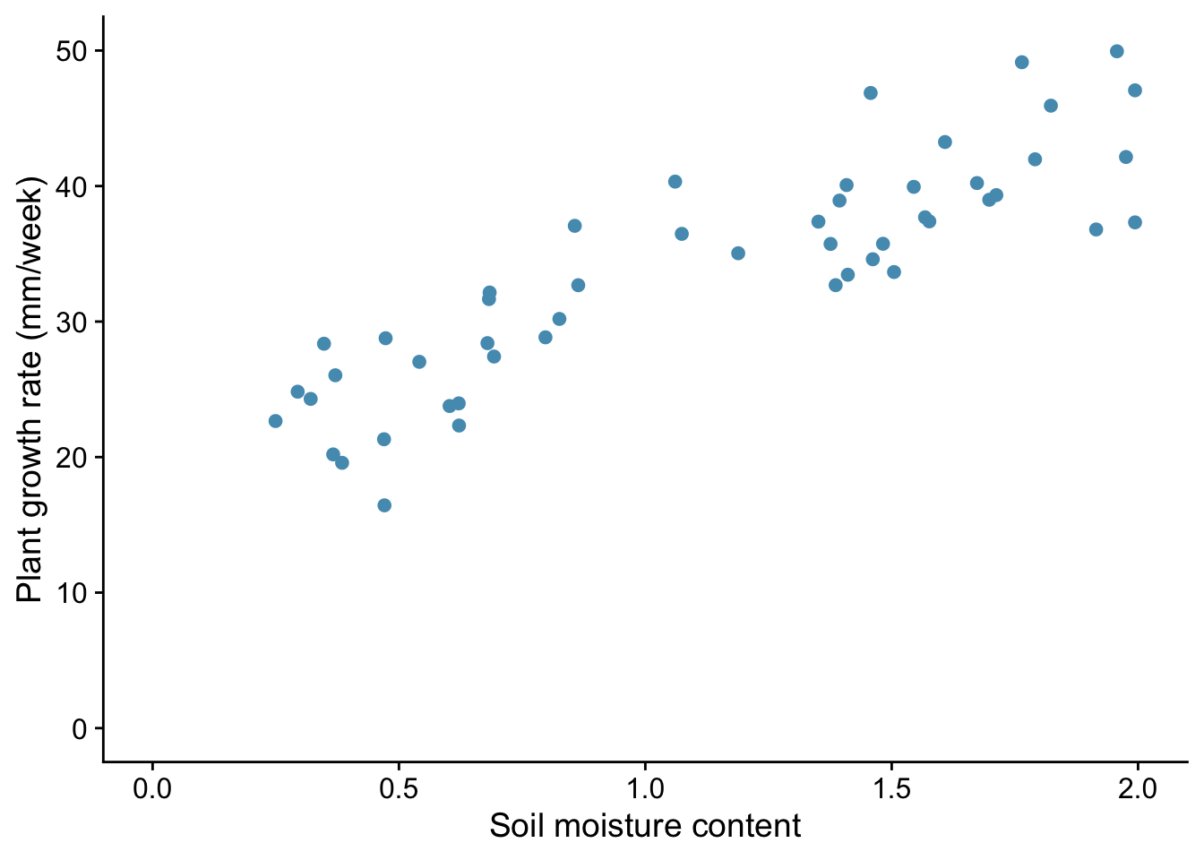
From the plot, we note that:
It is always good practice to examine the data before you go on to do any statistical analysis. For all but the smallest data sets, that means plotting them.
We use the function lm() to do this, and we save the results in an object to which we give the name model_pgr. This function needs a formula and some data as its arguments:
model_pgr<-lm(plant.growth.rate ~ soil.moisture.content, data = plants)This reads: ‘Fit a linear model, where we hypothesize that plant growth rate is a function of soil moisture content, using the variables from the plants data frame.’
Before we rush into interpreting the output of the model, we need to check whether it was valid to use a linear model in the first place. Whatever the test within which we are using a linear model, we should do the necessary diagnostic checks at this stage.
You can do this using tests designed for the purpose, but I prefer to do it graphically, using a function autoplot() from the package ggfortify. You give this the model we have just created using lm() and it produces four very useful graphs. I suggest that, after once installing ggfortify you include the line library(ggfortify) at the start of every script.
Here is how you use it:
autoplot(model_pgr, smooth.colour=NA) + theme_cowplot()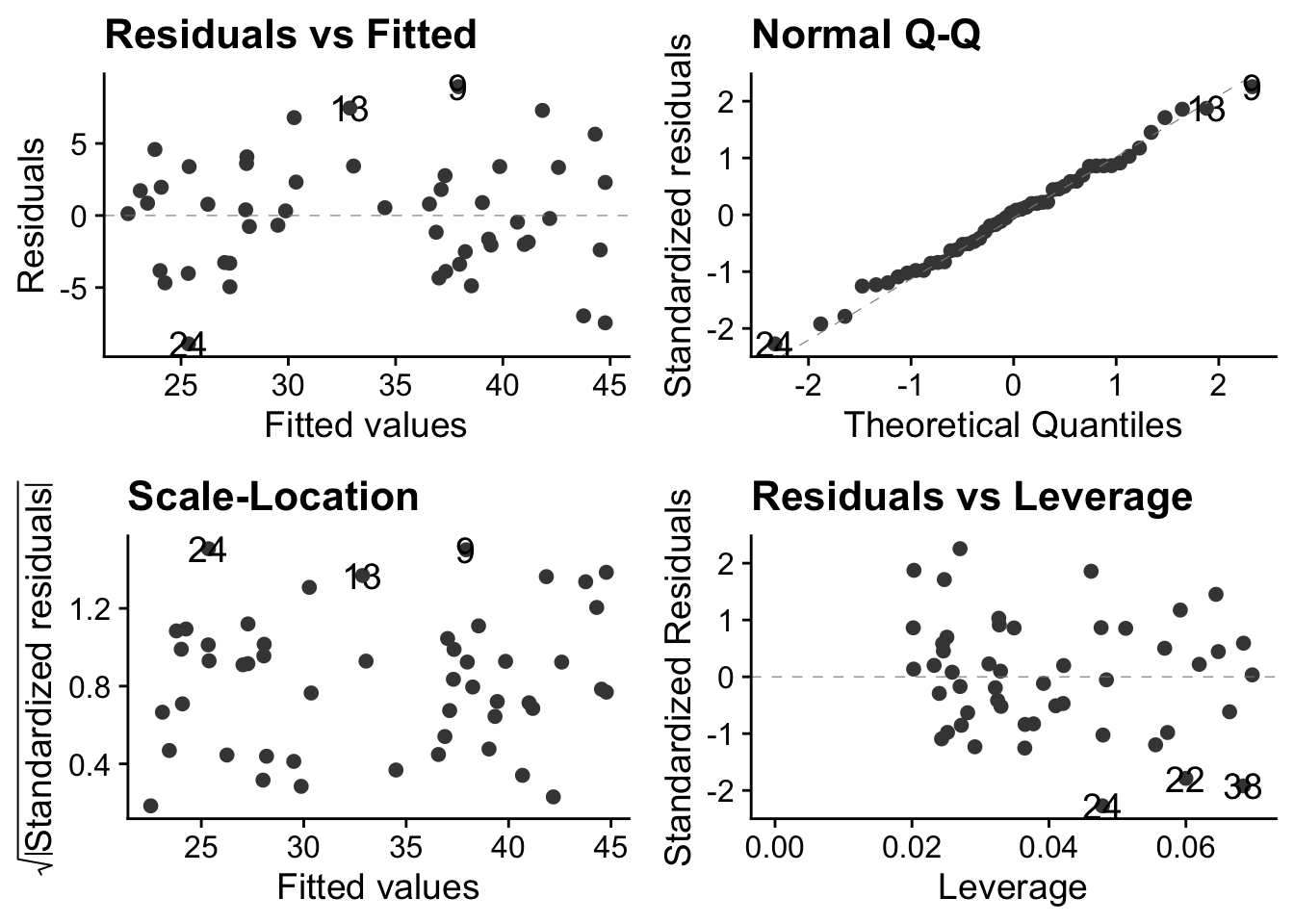
The theme_cowplot() part is not necessary, but it gives the plots a nice look, so why not?
These plots are all based around the `residuals’, which is the vertical distance between observed values and fitted values ie between each point and the best fit line through the points - the line which the linear model is finding for us, by telling us its intercept and gradient.
In simple linear regression, the best fit line is the one that minimises that sum of the squared residuals.
So what do these plots mean?
In the case of these data, we are good to go! There is no discernible pattern in either of the left-hand plots, the qq-plot is about as straight as you ever see with real data, and there are no points exerting undue high influence.
Now that we have established that the data meet the criteria required for the model to be valid, we can go ahead and inspect its output. We will do this using two tools that we also use for every other general linear model we implement (t-test, ANOVA etc). These are anova() and summary()
Let us first use anova():
anova(model_pgr)Analysis of Variance Table
Response: plant.growth.rate
Df Sum Sq Mean Sq F value Pr(>F)
soil.moisture.content 1 2521 2521 156 <2e-16 ***
Residuals 48 775 16
---
Signif. codes: 0 '***' 0.001 '**' 0.01 '*' 0.05 '.' 0.1 ' ' 1The F value here is an example of a ‘test statistic’, a number that a test calculates from the data, from which it is possible to further calulate how likely it is that you would have got the data you got if the null hypothesis were true. This particular test statistic is the ratio of the variation in the data that is explained by the explanatory variable to the leftover variance. The bigger it is, the better the job that the explanatory variable is doing at explaining the variation in the dependent variable. The p value, which here is effectively zero, is the chance you would have got an F value this big or bigger from the data in the sample if in fact there were no relationship between plant growth rate and soil moisture content. If the p value is small (and by that we usually mean less than 0.05) then we can reject the null hypothesis that there is no relationship between plant growth rate and soil moisture content.
Hence, in this case, we emphatically reject the null: there is clear evidence that plant growth rate is at least in part explained by soil moisture content.
Now we use the summary() function:
summary(model_pgr)
Call:
lm(formula = plant.growth.rate ~ soil.moisture.content, data = plants)

Residuals:
   Min     1Q Median     3Q    Max
-8.909 -3.075  0.226  2.657  8.941

Coefficients:
                      Estimate Std. Error t value Pr(>|t|)
(Intercept)              19.35       1.28    15.1   <2e-16 ***
soil.moisture.content    12.75       1.02    12.5   <2e-16 ***
---
Signif. codes:  0 '***' 0.001 '**' 0.01 '*' 0.05 '.' 0.1 ' ' 1

Residual standard error: 4.02 on 48 degrees of freedom
Multiple R-squared:  0.765, Adjusted R-squared:  0.76
F-statistic:  156 on 1 and 48 DF,  p-value: <2e-16
This gives us estimates of the intercept (19.348) and gradient (12.750) of the best fit line through the data. The null hypothesis is that both these values are zero, and the p-value is our clue as to whether we can reject this null. Here, in both cases, we clearly can.
We also see the Adjusted R-squared value of 0.7599. This is the proportion of the variance in the dependent variable that is explained by the explanatory variable. Thus it can vary between 0 and 1. A large value like this indicates that soil moisture content is a good predictor of plant growth rate.
Typically, a final step in our analysis involves including the model we have fitted into the original figure, if that is possible in a straightforward way. In the case of simple linear regression, it is. It means adding a straight line with the intercept and gradient displayed by the summary() function. We do this by adding a line geom_smooth(method = "lm") to our plot code:
plants |>
  ggplot(aes(x=soil.moisture.content, y=plant.growth.rate)) +
  geom_point() +
  geom_smooth(method = "lm") +
  labs(x="Soil moisture content",
       y="Plant growth rate (mm/week)") +
  xlim(0,2) +
  ylim(0,50) +
  theme_cowplot()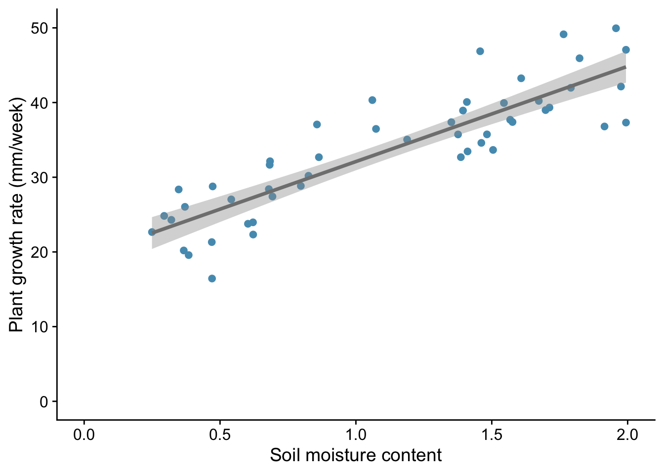
This gives both a straight line and the ‘standard error’ of that line - meaning, roughly speaking, the wiggle room within which the ‘true’ line , for the population as opposed to this sample drawn from it, probably lies.
We would likely want to include this plot in our report, along with a statement like:
We find evidence for a linear increase in plant growth rate with soil moisture content (p<0.001), with an additional 12.75 mm of growth per unit increase in soil moisture content.
We have carried out a simple linear regression on continuous data. This is an example of a general linear model. We first plotted the data, then we used lm() to fit the model. Next we inspected the validity of the model using autoplot. We then inspected the model itself using first anova() then summary(). Finally we included the output of the model on the plot, in this case by adding to it a straight line with the intercept and gradient determined by the regression model, and reported the result in plain English.
In this second example we provide the script but leave you to interpret the outcome of each step. Use the code snippets below to help you complete the notebook ocean-pH.qmd that is provided for you in the notebooks subfolder of the project lined to this chapter (if you haven’t aleady, you can download this using the link at the hed of this chapter.) If you do this then your notebook should follow exactly the same steps as for the plant growth example, but using different names.
Here we use data from Figure 5.20 of AR6, WG1 from the IPCC. It shows ocean pH measurements from a location (137\(^{\circ}\)E, 5\(^{\circ}\)N) in the western Pacific between 1980 and 2020.
Your task is to assess whether there is a significant linear trend in pH with time and if so to determiine the change in pH per year or per decade during the forty year period from 1980 to 2020.
library(tidyverse)
library(here)
library(ggfortify)
library(cowplot)pH_filepath <- here("data","ipcc_AR6_WGI_Figure_5_20-pH.csv")
pH<-read_csv(pH_filepath,skip=6) # we have to skip the first 6 lines because of meta-data included in the file - check it out!
glimpse(pH)Rows: 81
Columns: 2
$ year <dbl> 1984, 1985, 1986, 1987, 1987, 1988, 1989, 1990, 1991, 1991, 1991,…
$ pH <dbl> 8.10, 8.10, 8.09, 8.10, 8.07, 8.10, 8.10, 8.09, 8.08, 8.09, 8.07,…pH |>
ggplot(aes(x = year, y = pH)) +
geom_point() +
labs(x = "Year",
y = "Ocean pH") +
scale_y_continuous(limits=c(8.0,8.12), breaks=seq(8.0,8.2,0.02)) + #> 1
theme_cowplot()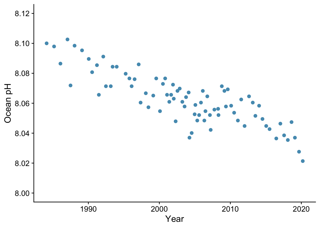
Is there a linear trend?
pH_model <- lm(pH ~ year, data= pH)autoplot(pH_model) + theme_cowplot()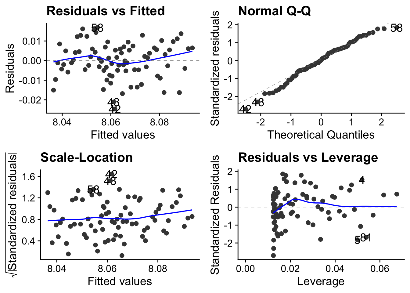
Is it reasonable to apply a linear model to these data? Remember that each of these plots tell you something about whether this is the case.
ANOVA
anova(pH_model)Analysis of Variance Table
Response: pH
Df Sum Sq Mean Sq F value Pr(>F)
year 1 0.0169 0.01694 200 <2e-16 ***
Residuals 79 0.0067 0.00008
---
Signif. codes: 0 '***' 0.001 '**' 0.01 '*' 0.05 '.' 0.1 ' ' 1Are we OK to reject the null hypothesis that pH does not change over this time period?
Summary
summary(pH_model)
Call:
lm(formula = pH ~ year, data = pH)

Residuals:
      Min        1Q    Median        3Q       Max
-0.024709 -0.004964  0.000219  0.006039  0.016881

Coefficients:
             Estimate Std. Error t value Pr(>|t|)
(Intercept) 11.234405   0.224330    50.1   <2e-16 ***
year        -0.001583   0.000112   -14.1   <2e-16 ***
---
Signif. codes:  0 '***' 0.001 '**' 0.01 '*' 0.05 '.' 0.1 ' ' 1

Residual standard error: 0.00921 on 79 degrees of freedom
Multiple R-squared:  0.717, Adjusted R-squared:  0.713
F-statistic:  200 on 1 and 79 DF,  p-value: <2e-16
What is the change in ocean pH per decade over the last four decades? Is this change statistically significant? Does the linear model account for much of the variance in the data?
pH |>
  ggplot(aes(x = year, y = pH)) +
  geom_point() +
  geom_smooth(method = "lm", colour = "blue") + # add the line. Method ="lm" for a straight line.
  labs(x = "Year",
       y = "Ocean pH") +
  scale_y_continuous(limits=c(8.0,8.12), breaks=seq(8.0,8.2,0.02)) + # fix limits and break points of y-axis
  annotate(geom="text", x = 2015, y = 8.11, label = "137W, 5N", size = 5) + # measurement site
  theme_cowplot()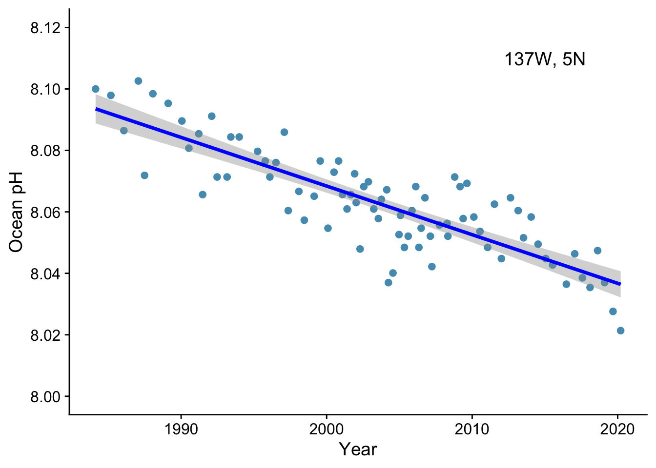
How would you report this result?
We now consider the common case where an outcome might arise as the combined result of more than one explanatory variable.
Suppose we wanted to know the potential timber yield from a tree. The direct but destructive way to find ot would be to chop it down and weigh it, but a more useful and non-destructive route would be if we could estimate it from variables that we could easily measure that would be reasonable predictors of timber yield, for example the girth of the trunk as measured by its diameter at breast height, and its height, which can easily be found using a protractor, a tape measure and simple trigonometry.
  here("data", "tree-volume.csv") |>
  read_csv() |>
  # filter(diameter < 1.6) |>
  glimpse() ->
  trees
Rows: 31
Columns: 3
$ diameter <dbl> 0.692, 0.717, 0.733, 0.875, 0.892, 0.900, 0.917, 0.917, 0.925…
$ height <dbl> 70, 65, 63, 72, 81, 83, 66, 75, 80, 75, 79, 76, 76, 69, 75, 7…
$ volume <dbl> 10.3, 10.3, 10.2, 16.4, 18.8, 19.7, 15.6, 18.2, 22.6, 19.9, 2…We would like to know if there is correlation between the potential predictors. If there is, we call this collinearity. We need to be aware of it since it can make i dificult to decide on the influence of any individual predictor.
Let us look at the correlations between all three variables:
GGally::ggpairs(trees)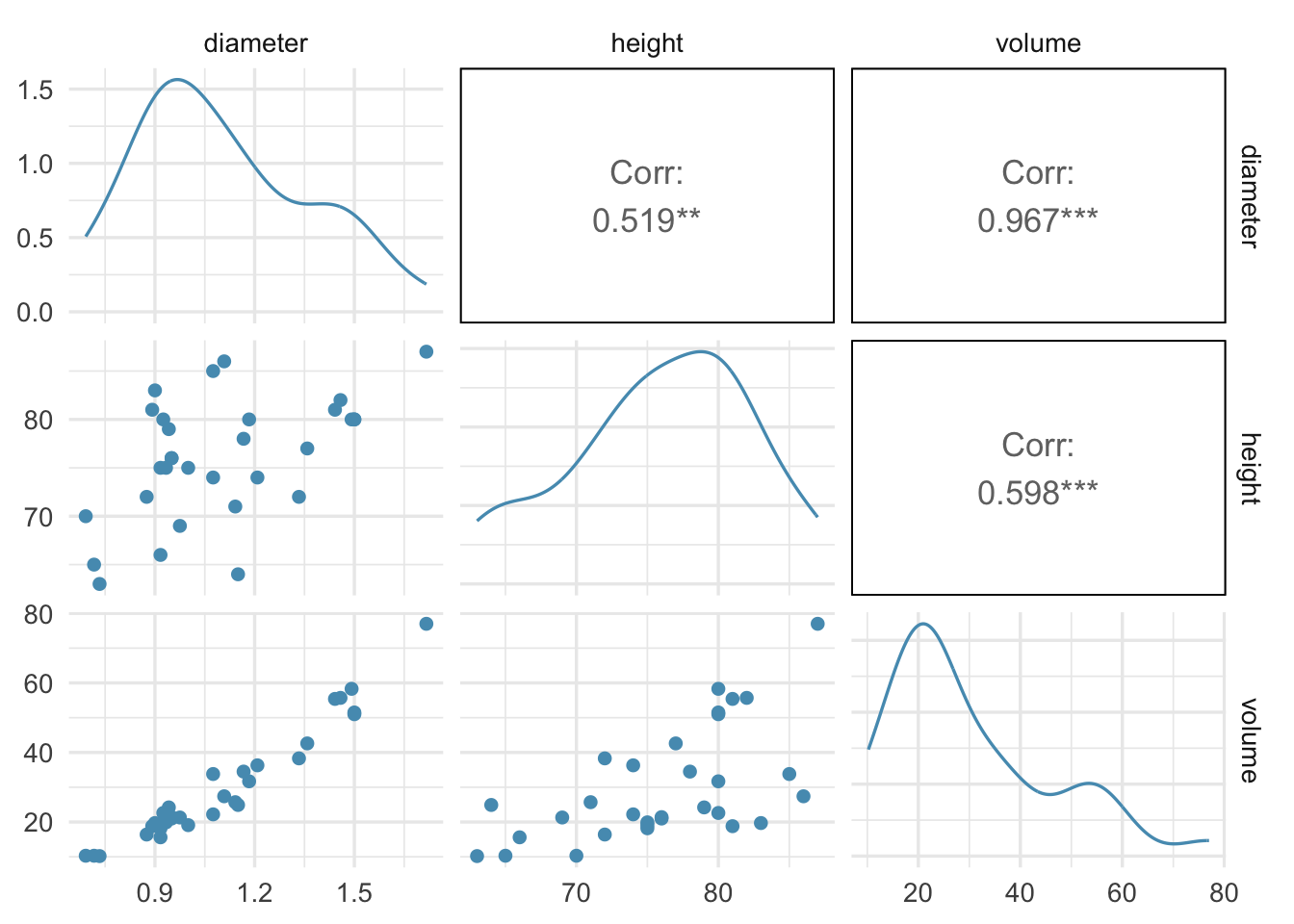
Tree volume is strongly correlated with tree girth and moderately correllated with tree height.
We see that there is correlation between girth and height, but it is not catastrophic. Since girth and height are our predictors, we sy that there is moderate collinearity between them.
First attempt at analysis: naive multiple linear regression
vol_dh <- lm(volume ~ diameter + height, data = trees)autoplot(vol_dh) + theme_cowplot()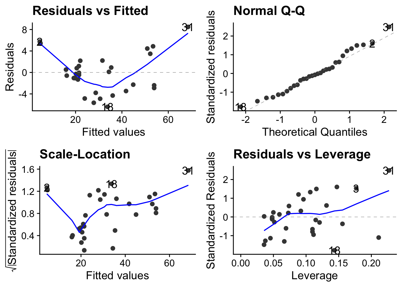
anova(vol_dh)Analysis of Variance Table
Response: volume
Df Sum Sq Mean Sq F value Pr(>F)
diameter 1 7582 7582 503.3 <2e-16 ***
height 1 102 102 6.8 0.014 *
Residuals 28 422 15
---
Signif. codes: 0 '***' 0.001 '**' 0.01 '*' 0.05 '.' 0.1 ' ' 1summary(vol_dh)
Call:
lm(formula = volume ~ diameter + height, data = trees)

Residuals:
   Min     1Q Median     3Q    Max
-6.404 -2.650 -0.285  2.200  8.482

Coefficients:
            Estimate Std. Error t value Pr(>|t|)
(Intercept)  -57.988      8.637   -6.71  2.7e-07 ***
diameter      56.499      3.171   17.82  < 2e-16 ***
height         0.339      0.130    2.61    0.014 *
---
Signif. codes:  0 '***' 0.001 '**' 0.01 '*' 0.05 '.' 0.1 ' ' 1

Residual standard error: 3.88 on 28 degrees of freedom
Multiple R-squared:  0.948, Adjusted R-squared:  0.944
F-statistic:  255 on 2 and 28 DF,  p-value: <2e-16
This analysis is telling us that girth is a highly significant predictor of volume (p<0.001) but that height is only weakly signficant (p = 0.0145).
This may not be true. The effect of height may bebeing masked by that of girth, which was given to the model first.
Variance Inflation Factor (VIF) scores as way of detecting co-linearity
Variable inflation factor (VIF) scores tell us if there is co-linearity. The higher the score, the more likely that variable is affected by co-linearity.
| VIF | Co-liniarity |
|---|---|
| 1 -5 | no collinearity |
| VIF > 5 | concerning |
| VIF > 10 | serious |
library(car)
vif(vol_dh)
diameter height
1.37 1.37 Our VIF scores are both low, suggesting there is no need to take account of co-linearity.
A better statistical model: transformation
THe above analysis shows that we could predict tree volume adequately using both diameter and height as predictors in an additive model. However a better approach might be to look more carefully at how volume arises from a combinaion of height and diameter.
Tree volume scales approximately with cross-sectional area × height, so a log–log model is more realistic: logarithms turn mutliplication into addition: log(xy) = log(x) +log(y), so if volume = diamter x height, then log(volume) = log(diameter) x log(height):
vol_dh_log <- lm(log(volume) ~ log(diameter) + log(height), data = trees)autoplot(vol_dh_log)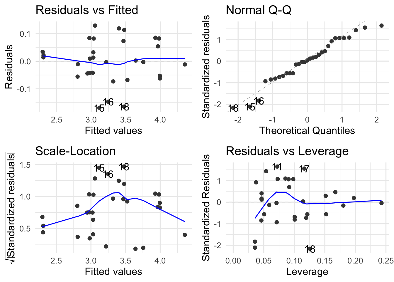
anova(vol_dh_log) + theme_cowplot()NULLsummary(vol_dh_log)
Call:
lm(formula = log(volume) ~ log(diameter) + log(height), data = trees)

Residuals:
     Min       1Q   Median       3Q      Max
-0.16855 -0.04852  0.00247  0.06363  0.12917

Coefficients:
              Estimate Std. Error t value Pr(>|t|)
(Intercept)     -1.705      0.882   -1.93    0.063 .
log(diameter)    1.983      0.075   26.43  < 2e-16 ***
log(height)      1.117      0.204    5.46  7.8e-06 ***
---
Signif. codes:  0 '***' 0.001 '**' 0.01 '*' 0.05 '.' 0.1 ' ' 1

Residual standard error: 0.0814 on 28 degrees of freedom
Multiple R-squared:  0.978, Adjusted R-squared:  0.976
F-statistic:  613 on 2 and 28 DF,  p-value: <2e-16
SO now both predictors ae highly significant.
The dataset For this exerecise, we make use of the enviro_indicators dataset from the Kaggle Global Environmental Indicators data. The dataset comprises socio-economic and environmental data collected from various countries, focusing on factors related to sustainable development. It includes information such as forest coverage, biodiversity index, protected areas, rural population, and deforestation rates, aimed at understanding the relationship between human activities and land degradation.